Upscale High-End Cabinetry
Fine Linens | NY, NY
Fine Linens has been the to-go-to location for interior designers and decorators and their sophisticated clientele. A fresh face-lift was on the agenda for 2014! The objective was to lighten up the fairly narrow shop, gain space and highlight all the unique high quality textures, colors and fabrics.
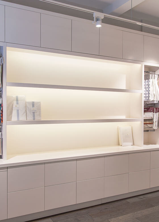
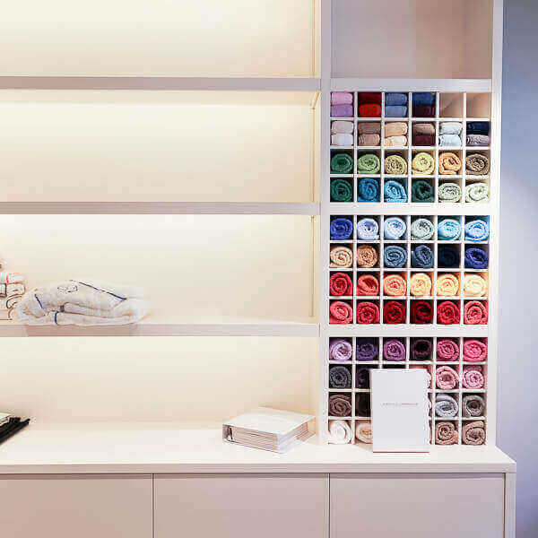
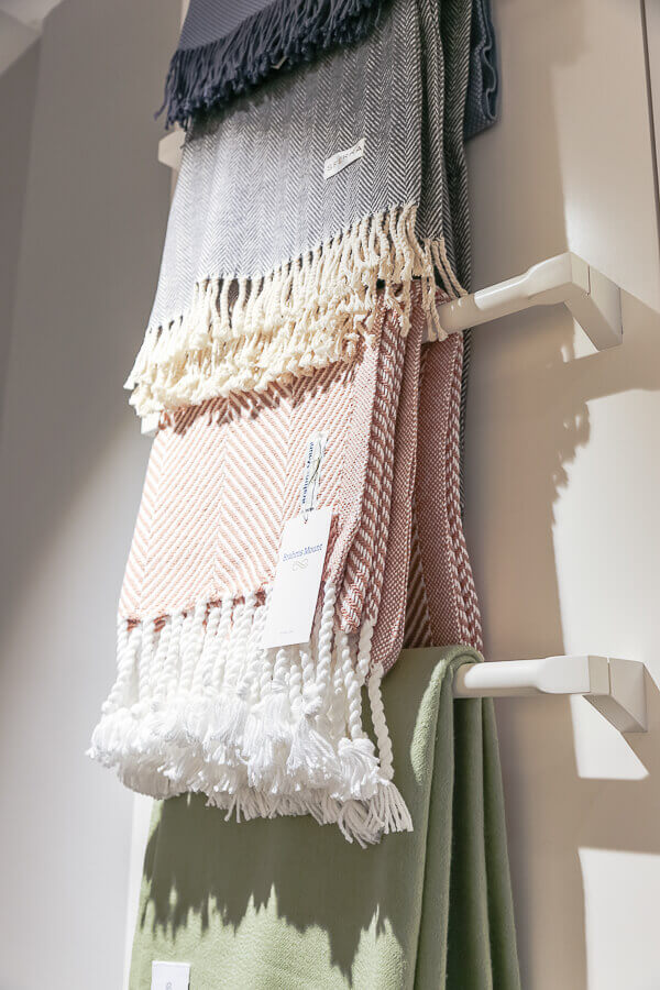
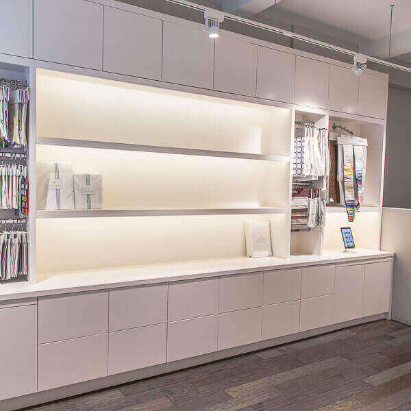
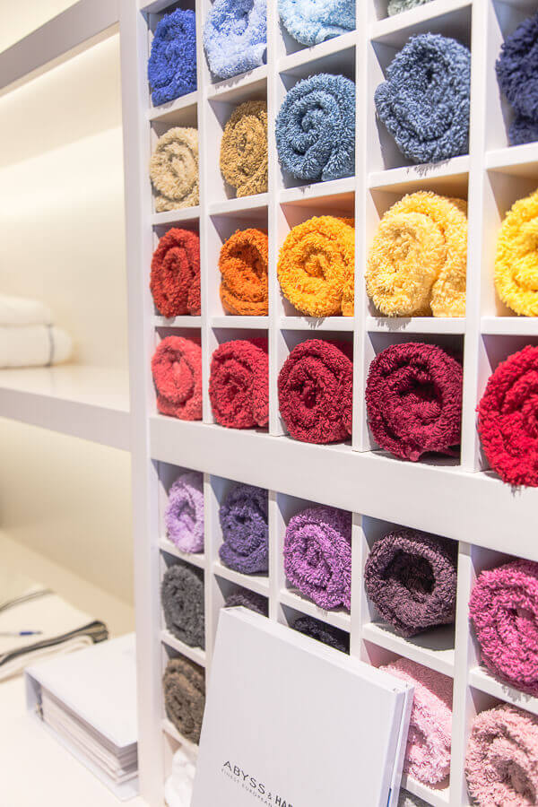
The store was covered with heavy oak shelving that felt overbearing and stuffy. Collaborating with the client’s interior designer, we wanted everything to be seamless, light and welcoming. The designs were showcasing modern lines that draw attention to the colorful product, creating a perfect backdrop to showcase the inventory.
Upon receiving the drawings with base elevation, we examined every inch of the store — which still had all the old interior structures in place, to get a feel of the flow. Evaluating the relationship of real world interior to the drawings we’ve received, was essential for efficiently concepting the build.
After taking exact measurements that ensure all curves, nooks and crannies are taken care of, we went to work. First base was translating the measurements and designs into 3D renderings, which helped us visualize the new store. Even though the design was already handed to us, some things were left to our interpretation. We wanted to ensure that all units would seamlessly integrate into the store area, achieving a light-filled continuing space. Being puzzle masters, every piece fit effortlessly into its designated spot.
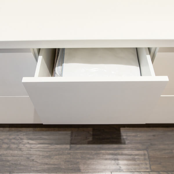
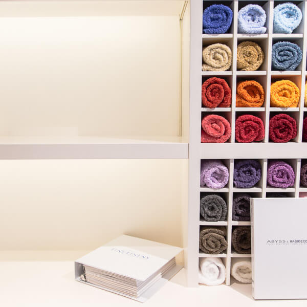
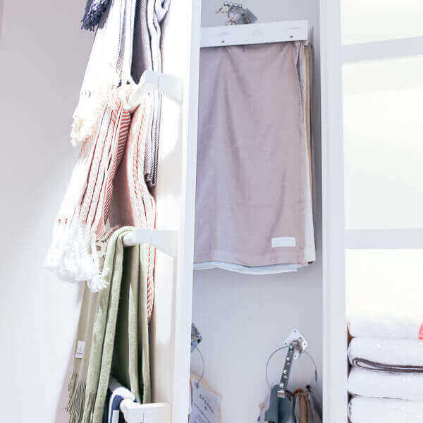
The final store is showcasing walls of shelving units, cubby holes and top-of-the-line hardware for the push-to-open drawers, all made out of maple. The lacquer finish was all done in our own spray room. The stores stark white interior now acts as a canvas housing the beautiful products of this boutique store.
